

Painting with Viviva Watercolors by Anne Kupillas

Viviva Colorsheets are perfect for travel painting, as they’re portable, lightweight and dry quickly.
But before I go on, you may be wondering: What are Viviva Colors?

What are Viviva Colors?
Viviva Colors is a family-owned business creating revolutionary products - pocket-size, portable, super vivid transparent watercolors, and accessories. Their colors are so punchy, so bright that you would think they’re alcohol inks, but they’re not. They’re watercolors. The products I use the most are the Colorsheets and the Cork Palette sets. I’ll talk about both, what’s different about them and how I use each of these in my practice.
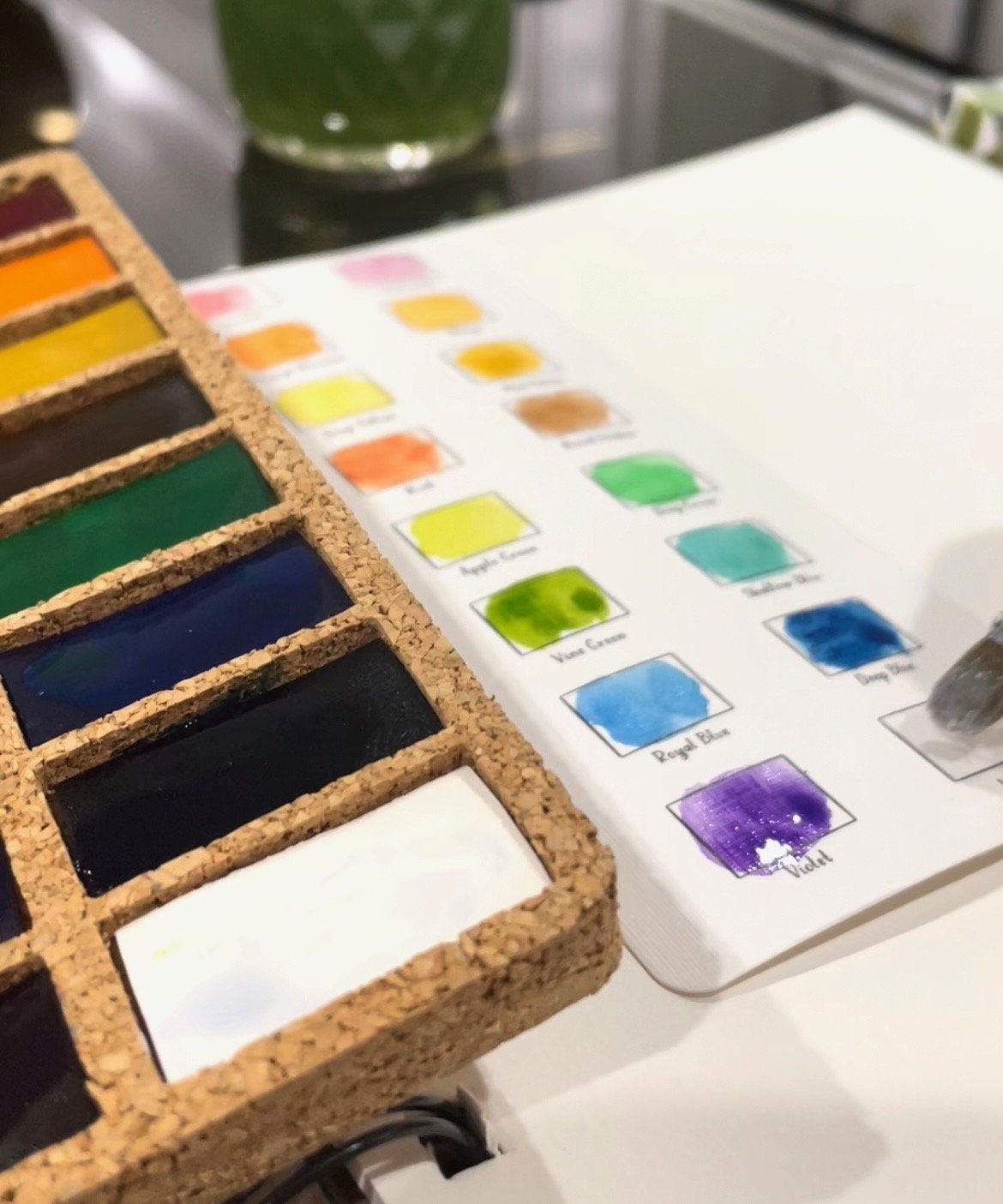
Viviva’s Cork Palette
The Cork Palette is a 16-color pan set, in an environmentally-conscious cork palette, which is perfect for studio and plein air use. Each of these pans are so concentrated, they are the equivalent of a half-pan by any other art brand, and thus will last a long, long time. Viviva includes a very handy swatch card (shown above) so you can test the colors out and I think it’s helpful to keep this, as there are no labels on the pans. Often I forget which pan holds the violet and which the royal blue - as you can see, the dried concentrated colors are deep and can look alike when dry. So swatch it out!
Also, the cover of the pans have a coated inside cover, which can be used as a palette. Very handy. The creators of Viviva really have thought of everything.

Viviva Colorsheets
The Colorsheets are a portable phone-sized packet of 16 colors that retail for $22 each. The clever design gives you a ton of paint in a small, lightweight package. Each square of color is painted on in multiple layers, so there is about a half-pan’s worth of pigment in each of these tiny squares! Imagine my delight when I found these for travel and plein air sketching and painting! I think a lot of illustrators or novice artists use Viviva, but I also hope that professional artists will give them more of a place in their materials kit, because they are so versatile and provide such saturated colors.
Another great feature is that you can easily flip this open and get to the color you want right away, because there are colored tabs at the bottom of the packet, that show you which colors are on each page. Each of the pages is separated by a vellum sheet, so that the colors don’t mess with each other, when wet, and this means the dry pigment also doesn’t transfer to each page, either. There are currently four different sets you can buy:
- Original Colorsheets
- Metallics
- Spring Set
- Fall Set
They have some overlap, but many colors are unique to each set, so I bought them all!
Lastly, each of the Colorsheet sets comes with a small coated piece of cardboard, that you peel and stick on the back flap, and serves as a palette. Just wipe it clean before you close up the packet when you’re done painting.

Each set of Colorsheets has a swatch area with the name of the color. It’s a great idea to swatch out the colors before you start to paint.
The clever folks at Viviva have included a helpful video that teaches you how to use the Colorsheets to get the maximum use of them, and keep them clean (and to keep your fingers clean, too — Viviva colors are highly staining!). There are lots of tips on the LEARN section of their website, as well as videos.
How I like to use Viviva
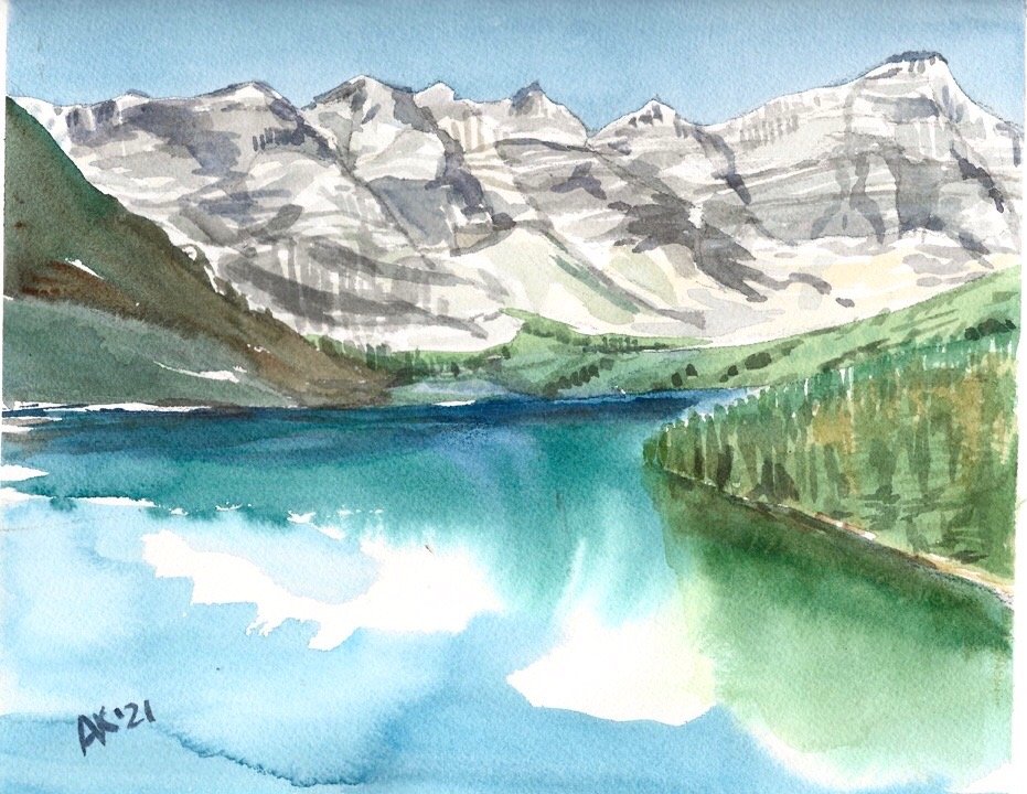
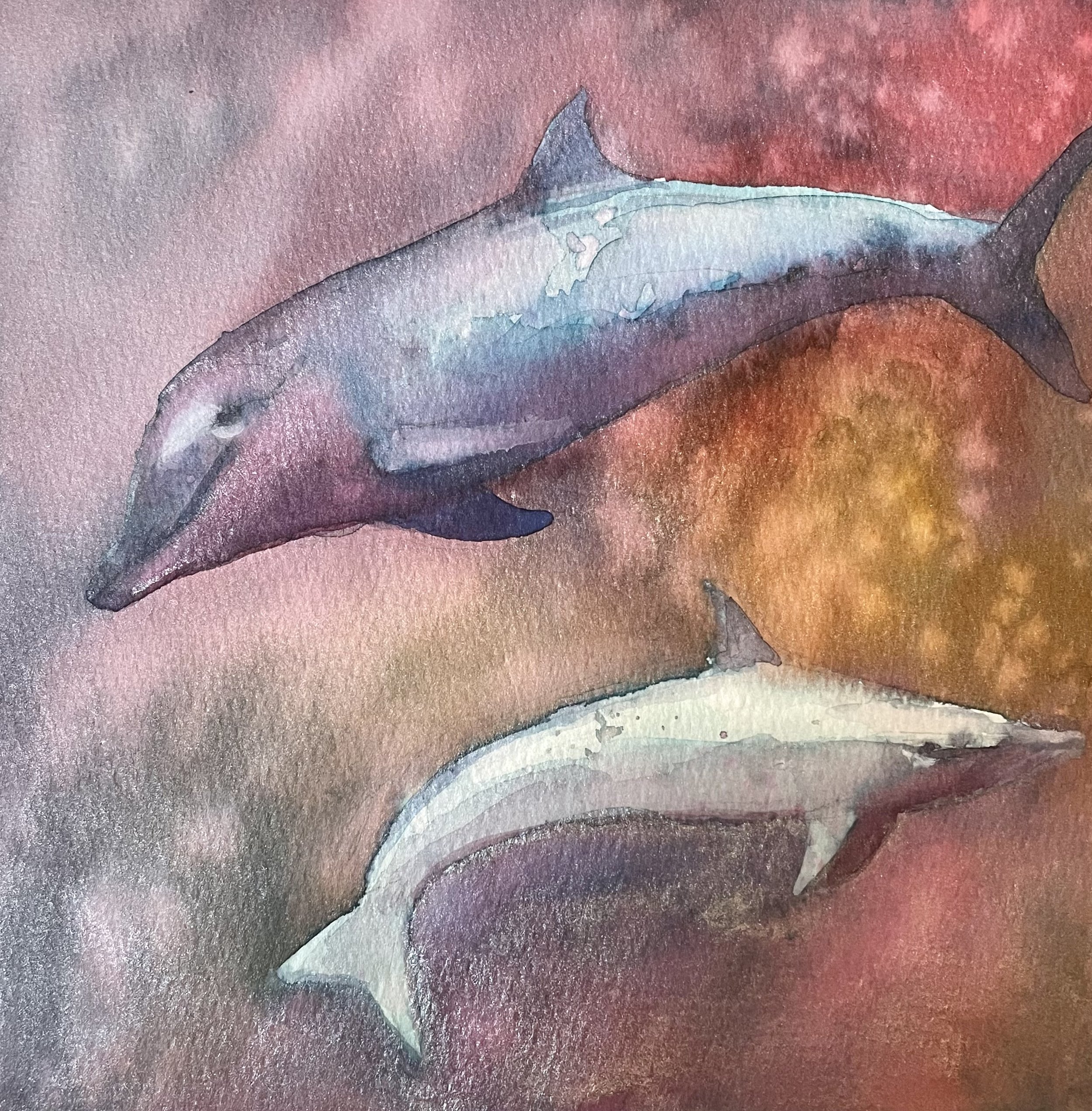
I use Viviva paints both on their own, and in conjunction with other paints, like Daniel Smith tube paints, and also with ink , as in the sketch above. I like to paint fairly wet and juicy washes, and I find that Viviva partners really well with Arches brand paper. The superior sizing in Arches paper holds the bright colors and doesn’t allow them to fade or spread on the inside of the paper. I mean, look how bright these colors are!

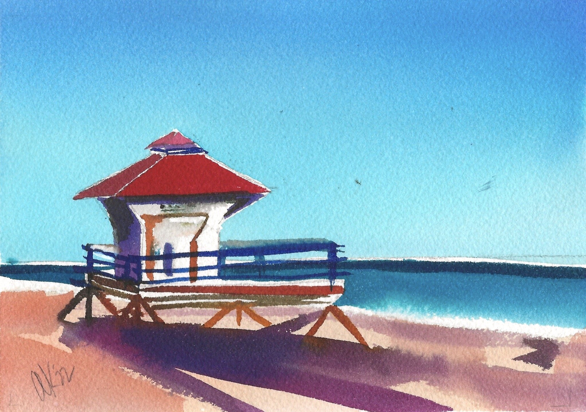
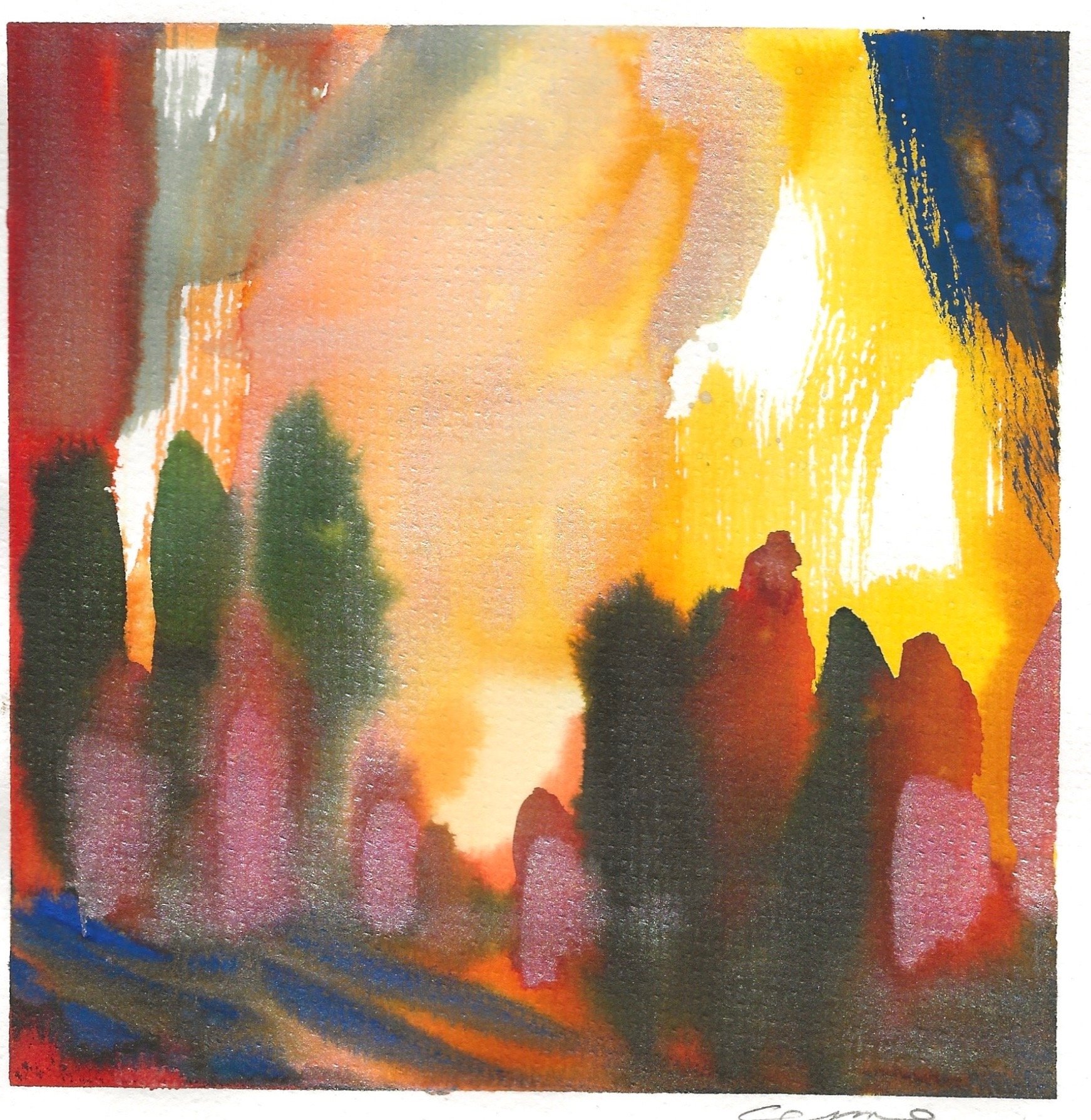
I use Viviva a lot when doing plein air sketching. I mix colors to take out the chroma, as in the shadow in the left foreground. And I use many colors “straight,” as in the oranges, yellows and turquoise shown in the buildings and signage.

I find that nothing beats Viviva for getting the glacial blues of mountain streams and lakes. The colors flow very well, I don’t know how — there must be an additive like glycerin in the recipe - so they make excellent smooth washes for both skies and water, and when I need to make relatively large wash areas in a single color or gradation, I find the Viviva very suitable for the task.

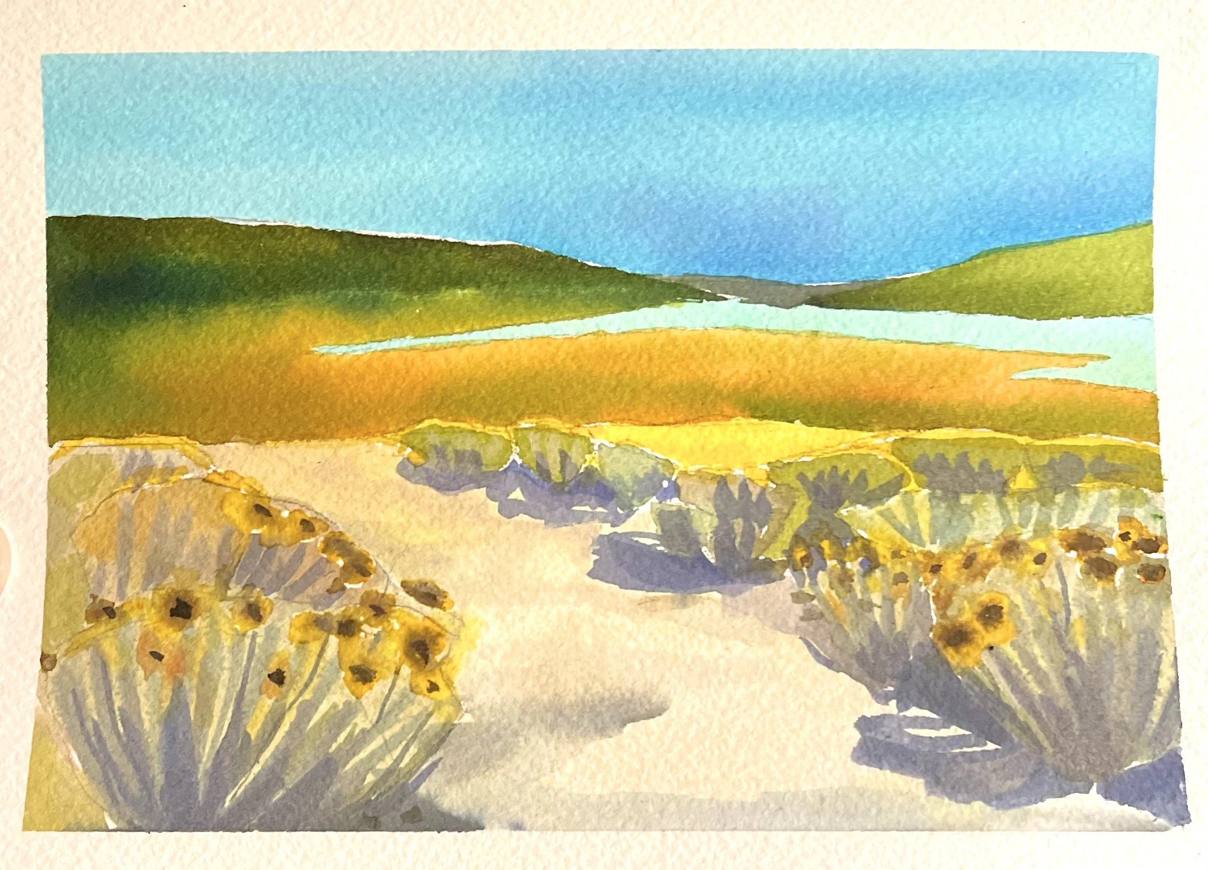
This is a typical example of how I combine Viviva Colors with more traditional watercolors from the tube, especially using neutral colors and earth tones, such as the Daniel Smith Buff Titanium and Titanium Gray used in the three paintings above and the one below of Mather Pass. This gives me punchy color where I want it, but also the textural play from traditional tube paints, especially when using dry brush or wanting granulation in my paints. Viviva paints are dyes and do not granulate. I personally don’t like using a granulation medium (I feel the results are too dark “gritty”), but you may want to try adding some to your puddle of Viviva paint and see if you can approximate the effect of granulation with these pigments.
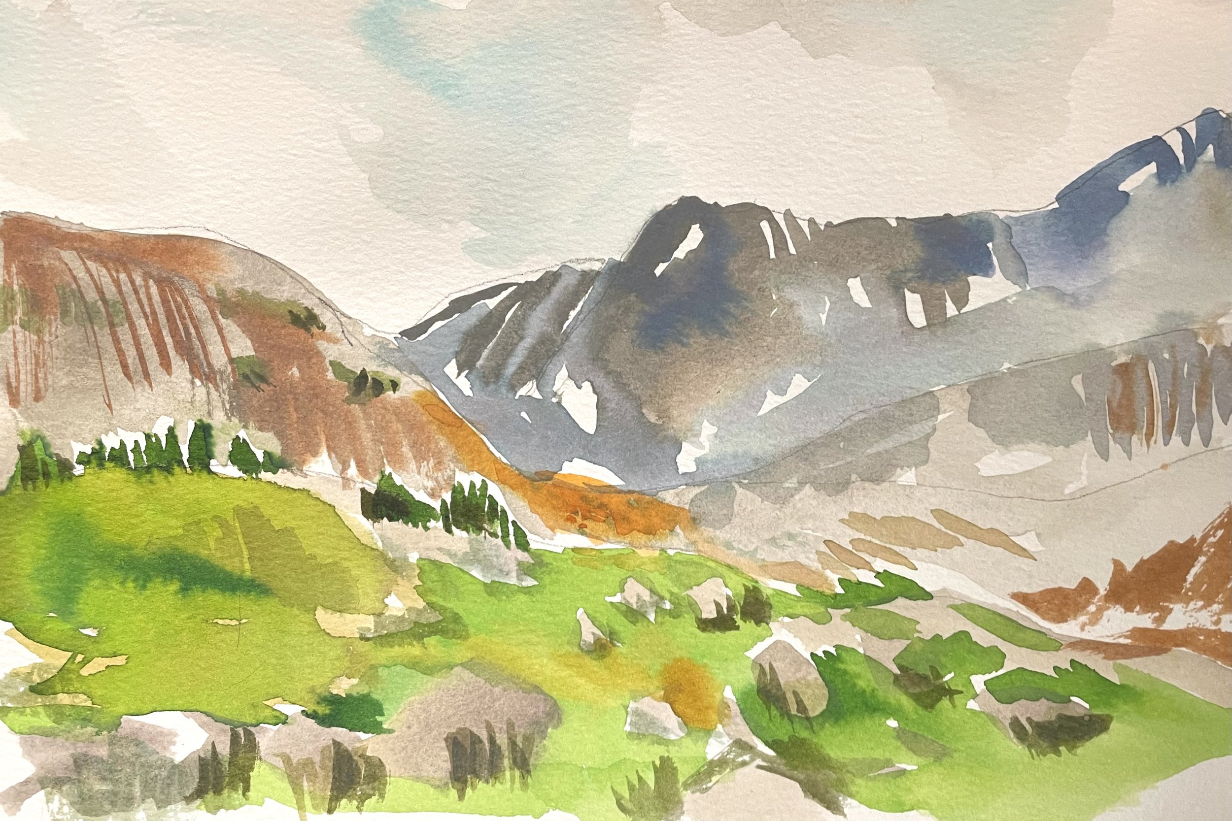
Combining Viviva brights with traditional watercolor pigments in neutrals like Buff Titanium, Titanium Gray, Burnt Sienna and Indigo gives me the contrast and pops that I’m looking for and hadn’t been able to achieve previous to discovering Viviva. I can combine them in the palette and also on the page.
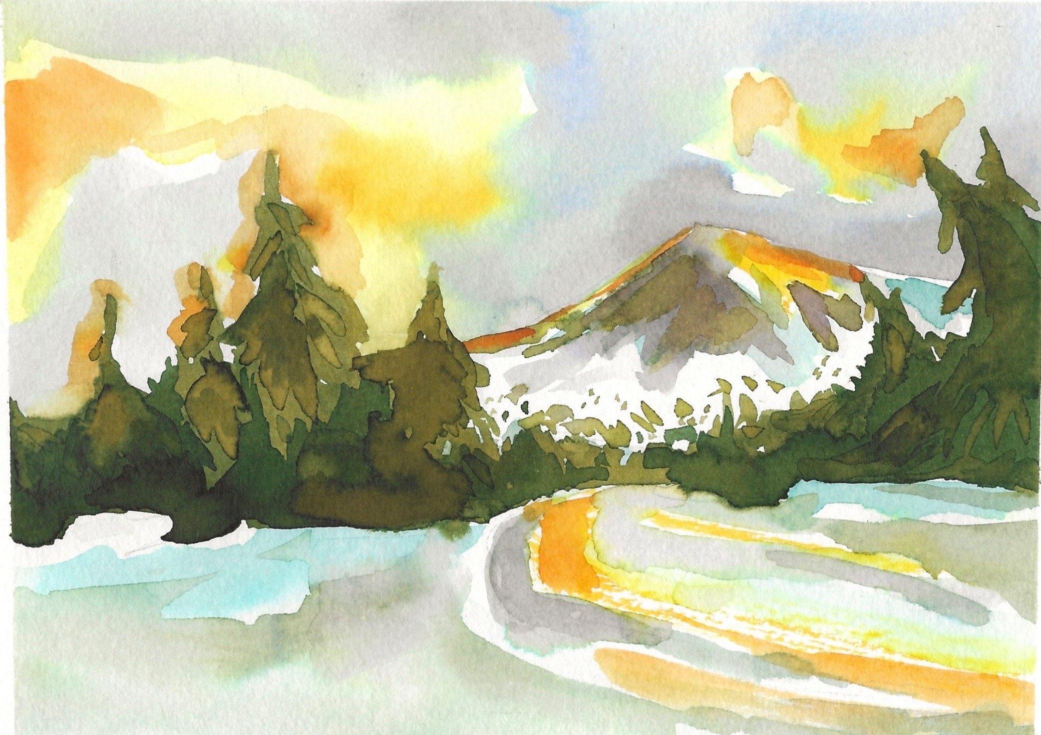
I use Viviva’s saturated yellows and oranges to create the glow in my paintings. Also notice how pushy the greens are here, as seen in the pine trees. I love the way you can layer Viviva colors and they will do some unexpected things. In fact, I now can expect the unexpected!
Abstraction vs Realism
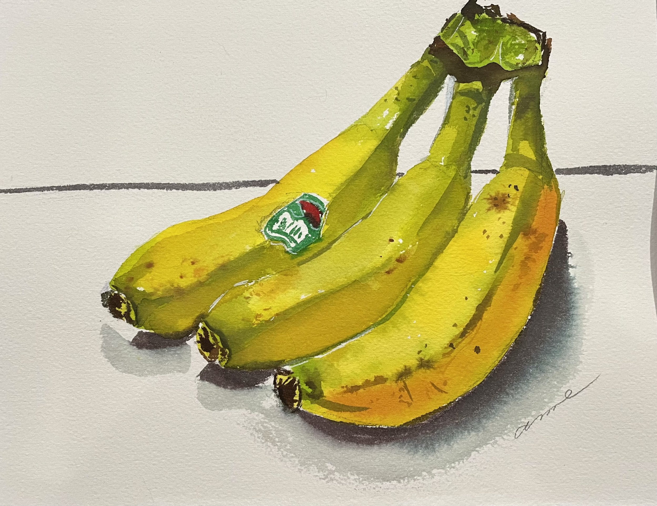
Until now, I’ve showcase many paintings there I’ve taken liberties in terms of my color choices, level of abstraction and so on. But Viviva CAN easily be used just like traditional watercolors and you can achieve very naturalistic renderings with them, as in this bunch of bananas below.
The trick is to tone down the vivid colors with their complement — the opposite hue on the color wheel. So, to tone down orange, add some blue. To neutralize red, use a little green, and with yellow, use purple. You can always also add a bit of any earth tone like brown or gray to take chroma out of the brightest colors.
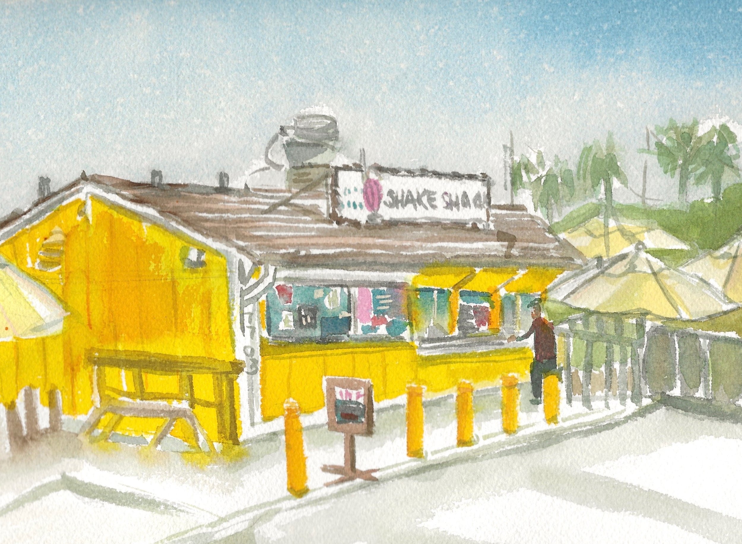
On Yellows.
Yellows! Viviva has THE BEST most bright yellows I’ve ever found. Check these out. You can punch up a painting with your more traditional brand colors with just adding a little pop in yellow or another one of Viviva’s super bright options.
Viviva sells refills for your products, too. So if you use a lot of yellow like I do (or any other color), you can simply buy a refill and load up again. For the color sheets, it’s a sheet for $5 and you just stick it over your depleted sheet.


Also, the metallics can really impact a dull painting that’s lacking in sparkle. Here’s an example of the metallic paints. I love these pinks and silvers, layered over non-metallic colors.
Final Thoughts:
If you’re considering trying out a new material but you don’t want to make a huge leap to a different medium, I urge you to treat yourself to some Viviva Colors! And have fun playing with them. Use them with a lot of water, use them almost straight from the palette - as you can see from my pictures above, you can use them in so many ways!
If you are someone who loves to paint please share your work below in the comment section or write to us at support@vivivacolors.com.
This Blog is created by one of our Viviva Ambassador Artist - Anne Kupilles
Happy painting to you guys and see you in the next one :)
